
Hero Image Full Height (minimum 1500px, up to 2560 px wide) - 1920px most common browswer width in NA
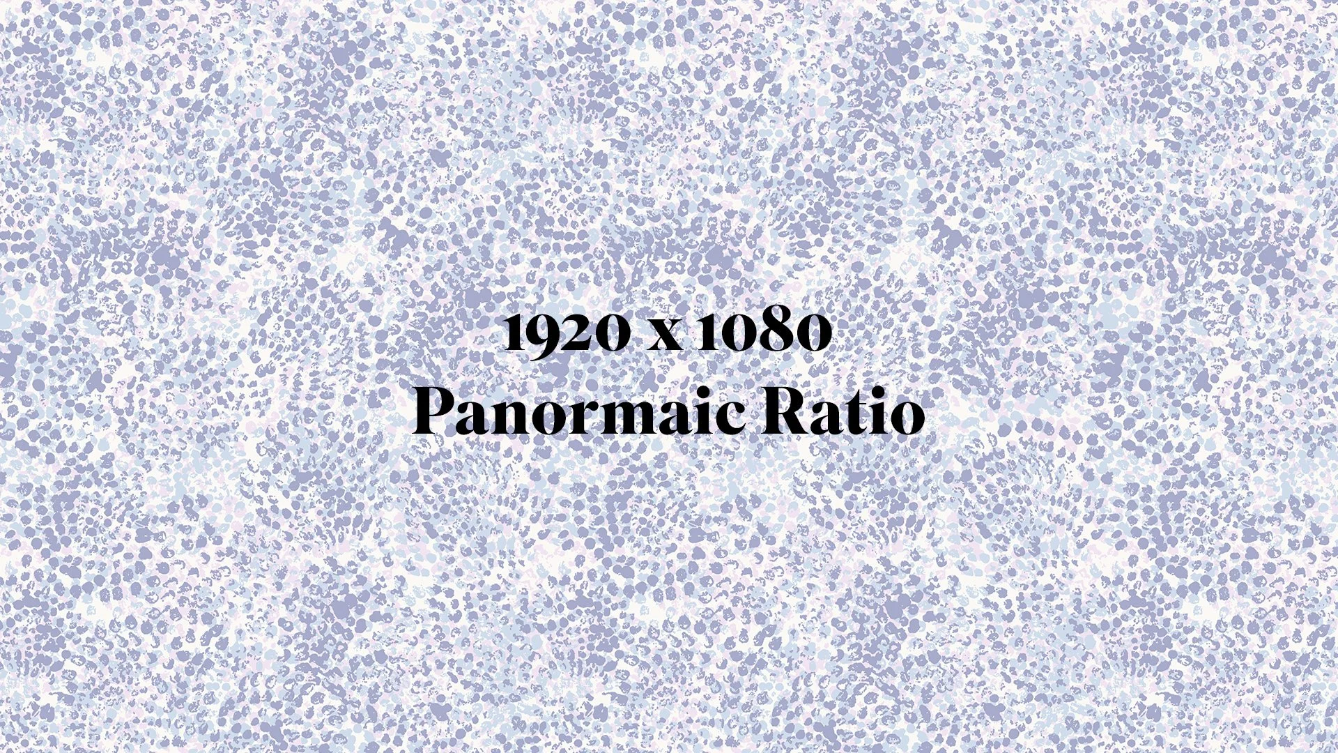
Background Section Image (1920 x 1080 px)
Horizontal Slideshow Images (up to 1500 px wide)
Blog Posts (1200-1500 px longest side)
Vertical Images (1200-1500 px wide)
Social Media Icons (minimum 32 px wide)
Favicons (minimum 16 px, up to 32 px wide)
Product Gallery Images (up to 1500 px wide)
Logo Icons 4 Nav (160px)
Mobile Images (1080px)
** Vertical orientation for mobile is 4:5 (1080 x 1350px) **
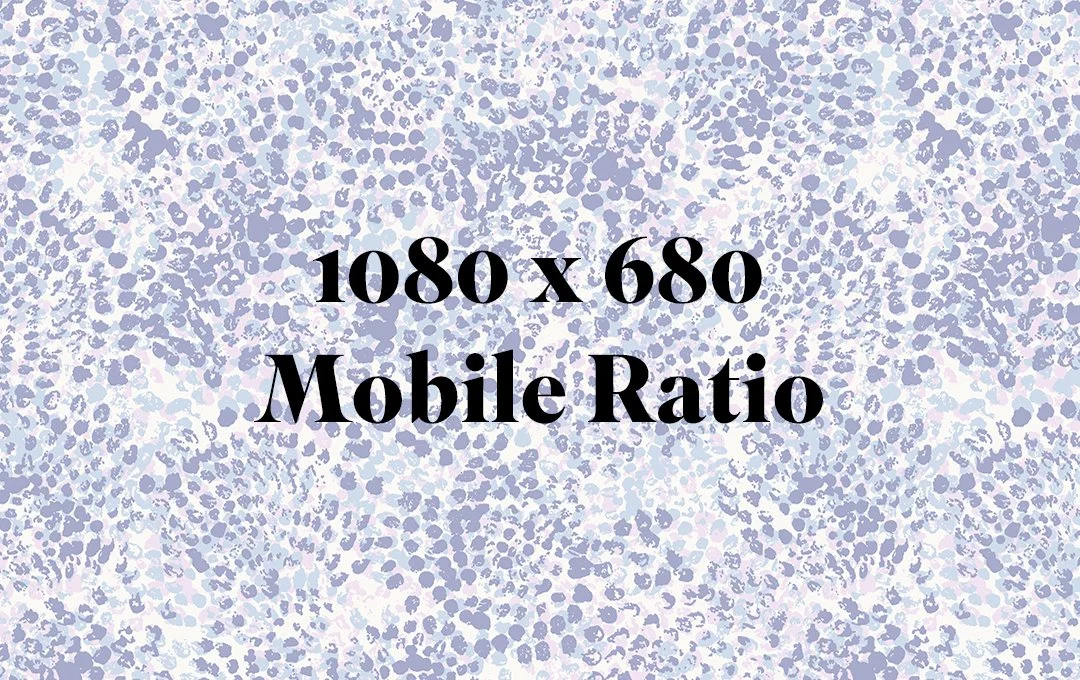
Mobile Images (1080 x 680px)
Blog Posts (1200-1500 px wide)
Vertical Images (2:3)
Logo Icons 4 Nav (250 x 100 px)
** Standard for blog (FB and LinkedIn) is 1.91:1 (1200 x 627px) **
Heading 1 · HEADING ONE
Second Largest Heading!
Heading 3 III · HEADING THREE
MonospaceSmallest Heading · SMALLEST HEADING
This is paragraph size three (the smallest). I remember your art print idea and I’m very intrigued by it, I feel like it could be a good way to get my practice back to “artist” as opposed to purely “designer”, I also like the idea of the original maybe being formed after the design through embellishment, embroidery etc…some logistics to work out as you say, but I think there’s something there and it opens up a different avenue for conversations and (buzzword) storytelling!
This is paragraph size two, one size smaller than the largest size. I remember your art print idea and I’m very intrigued by it, I feel like it could be a good way to get my practice back to “artist” as opposed to purely “designer”, I also like the idea of the original maybe being formed after the design through embellishment, embroidery etc…some logistics to work out as you say, but I think there’s something there and it opens up a different avenue for conversations and (buzzword) storytelling!
This is the largest paragraph size. I remember your art print idea and I’m very intrigued by it, I feel like it could be a good way to get my practice back to “artist” as opposed to purely “designer”, I also like the idea of the original maybe being formed after the design through embellishment, embroidery etc…some logistics to work out as you say, but I think there’s something there and it opens up a different avenue for conversations and (buzzword) storytelling!
This is paragraph size three (the smallest). I remember your art print idea and I’m very intrigued by it, I feel like it could be a good way to get my practice back to “artist” as opposed to purely “designer”, I also like the idea of the original maybe being formed after the design through embellishment, embroidery etc…some logistics to work out as you say, but I think there’s something there and it opens up a different avenue for conversations and (buzzword) storytelling!